TensorFlow 2.0 : Beginner Tutorials : Estimator :- 勾配ブースティング木: モデル理解 (翻訳/解説)
翻訳 : (株)クラスキャット セールスインフォメーション
作成日時 : 10/11/2019
* 本ページは、TensorFlow org サイトの TF 2.0 – Beginner Tutorials – Estimator の以下のページを
翻訳した上で適宜、補足説明したものです:
* サンプルコードの動作確認はしておりますが、必要な場合には適宜、追加改変しています。
* ご自由にリンクを張って頂いてかまいませんが、sales-info@classcat.com までご一報いただけると嬉しいです。

- お住まいの地域に関係なく Web ブラウザからご参加頂けます。事前登録 が必要ですのでご注意ください。
- Windows PC のブラウザからご参加が可能です。スマートデバイスもご利用可能です。
◆ お問合せ : 本件に関するお問い合わせ先は下記までお願いいたします。
| 株式会社クラスキャット セールス・マーケティング本部 セールス・インフォメーション |
| E-Mail:sales-info@classcat.com ; WebSite: https://www.classcat.com/ |
| Facebook: https://www.facebook.com/ClassCatJP/ |
Estimator :- 勾配ブースティング木: モデル理解
勾配ブースティング・モデルを訓練する end-to-end ウォークスルーについては ブースティング木チュートリアル を調べてください。このチュートリアルで貴方は :
- ブースティング木モデルをローカルとグルーバルの両者でどのように解釈するかを学習します。
- ブースティング木モデルがデータセットにどのように fit するかについて直感を得ます。
ブースティング木モデルをローカルとグローバルの両者でどのように解釈するか
ローカル解釈可能性 (= interpretability) は個別のサンプルレベルでのモデルの予測の理解を参照し、その一方で、グルーバル解釈可能性は全体としてのモデルの理解を参照します。そのようなテクニックは機械学習 (ML) 実践者にモデル開発段階でバイアスとバグを検出する助けとなれます。
ローカル解釈可能性については、どのようにインスタンス毎の寄与を作成して可視化するかを学習します。これを特徴量重要度と区別するため、これらの値を DFC (directional feature contributions) として参照します。
グローバル解釈可能性については、gain-based 特徴量重要度、再配列 (= permutation) 特徴量重要度 を取得して可視化し、そしてまた総計 (= aggregated) DFC を示します。
タイタニック・データセットをロードします
タイタニック・データセットを使用していきます、そこでは (寧ろ憂鬱な) 目標は性別、年齢、クラス, etc. のような特質が与えられたときに乗客の生存を予測することです。
from __future__ import absolute_import, division, print_function, unicode_literals

import numpy as np
import pandas as pd
from IPython.display import clear_output

# Load dataset.
dftrain = pd.read_csv('https://storage.googleapis.com/tf-datasets/titanic/train.csv')
dfeval = pd.read_csv('https://storage.googleapis.com/tf-datasets/titanic/eval.csv')
y_train = dftrain.pop('survived')
y_eval = dfeval.pop('survived')
import tensorflow as tf
tf.random.set_seed(123)
特徴の説明については、前のチュートリアルを見直してください。
特徴カラム、input_fn を作成して estimator を訓練する
データを前処理する
元の numeric column そのままと one-hot-エンコーディング categorical 変数を使用して特徴カラムを作成します。
fc = tf.feature_column
CATEGORICAL_COLUMNS = ['sex', 'n_siblings_spouses', 'parch', 'class', 'deck',
                       'embark_town', 'alone']
NUMERIC_COLUMNS = ['age', 'fare']

def one_hot_cat_column(feature_name, vocab):
  return fc.indicator_column(
      fc.categorical_column_with_vocabulary_list(feature_name,
                                                 vocab))
feature_columns = []
for feature_name in CATEGORICAL_COLUMNS:
  # Need to one-hot encode categorical features.
  vocabulary = dftrain[feature_name].unique()
  feature_columns.append(one_hot_cat_column(feature_name, vocabulary))

for feature_name in NUMERIC_COLUMNS:
  feature_columns.append(fc.numeric_column(feature_name,
                                           dtype=tf.float32))
入力パイプラインを構築する
Pandas から直接データを読み込むために tf.data API の from_tensor_slices メソッドを使用して入力関数を作成します。
# Use entire batch since this is such a small dataset.
NUM_EXAMPLES = len(y_train)

def make_input_fn(X, y, n_epochs=None, shuffle=True):
  def input_fn():
    dataset = tf.data.Dataset.from_tensor_slices((X.to_dict(orient='list'), y))
    if shuffle:
      dataset = dataset.shuffle(NUM_EXAMPLES)
    # For training, cycle thru dataset as many times as need (n_epochs=None).
    dataset = (dataset
      .repeat(n_epochs)
      .batch(NUM_EXAMPLES))
    return dataset
  return input_fn

# Training and evaluation input functions.
train_input_fn = make_input_fn(dftrain, y_train)
eval_input_fn = make_input_fn(dfeval, y_eval, shuffle=False, n_epochs=1)
モデルを訓練する
params = {
  'n_trees': 50,
  'max_depth': 3,
  'n_batches_per_layer': 1,
  # You must enable center_bias = True to get DFCs. This will force the model to
  # make an initial prediction before using any features (e.g. use the mean of
  # the training labels for regression or log odds for classification when
  # using cross entropy loss).
  'center_bias': True
}

est = tf.estimator.BoostedTreesClassifier(feature_columns, **params)
# Train model.
est.train(train_input_fn, max_steps=100)

# Evaluation.
results = est.evaluate(eval_input_fn)
clear_output()
pd.Series(results).to_frame()
| accuracy | 0.806818 |
| accuracy_baseline | 0.625000 |
| auc | 0.866606 |
| auc_precision_recall | 0.849128 |
| average_loss | 0.421549 |
| global_step | 100.000000 |
| label/mean | 0.375000 |
| loss | 0.421549 |
| precision | 0.755319 |
| prediction/mean | 0.384944 |
| recall | 0.717172 |
パフォーマンスの理由のため、貴方のデータがメモリに収まるときは、boosted_trees_classifier_train_in_memory 関数を使用することを勧めます。けれども訓練時間が関心事ではないか、あるいは非常に巨大なデータセットを持ち分散訓練を行なうことを望む場合には、上で示された tf.estimator.BoostedTrees API を使用してください。
このメソッドを使用するとき、入力データをバッチ化するべきではありません、何故ならばメソッドはデータセット全体上で作用するからです。
in_memory_params = dict(params)
in_memory_params['n_batches_per_layer'] = 1
# In-memory input_fn does not use batching.
def make_inmemory_train_input_fn(X, y):
  y = np.expand_dims(y, axis=1)
  def input_fn():
    return dict(X), y
  return input_fn
train_input_fn = make_inmemory_train_input_fn(dftrain, y_train)

# Train the model.
est = tf.estimator.BoostedTreesClassifier(
    feature_columns,
    train_in_memory=True,
    **in_memory_params)

est.train(train_input_fn)
print(est.evaluate(eval_input_fn))
{'accuracy_baseline': 0.625, 'loss': 0.41725963, 'auc': 0.86810529, 'label/mean': 0.375, 'average_loss': 0.41725963, 'accuracy': 0.80681819, 'global_step': 153, 'precision': 0.75531918, 'prediction/mean': 0.38610166, 'recall': 0.71717173, 'auc_precision_recall': 0.8542586}
モデル解釈とプロット
import matplotlib.pyplot as plt
import seaborn as sns
sns_colors = sns.color_palette('colorblind')
ローカル解釈可能性
次に個々の予測を説明するために Palczewska et al と Interpreting Random Forests で Saabas により概説されたアプローチを使用して DFC (directional feature contributions) を出力します (このメソッドはまた treeinterpreter パッケージで Random Forests のための scikit-learn でも利用可能です)。DFC は次で生成されます :
pred_dicts = list(est.experimental_predict_with_explanations(pred_input_fn))
(Note: このメソッドは experimental として命名されていますがこれは experimental prefix を落とす前に API を変更するかもしれないためです。)
pred_dicts = list(est.experimental_predict_with_explanations(eval_input_fn))
# Create DFC Pandas dataframe.
labels = y_eval.values
probs = pd.Series([pred['probabilities'][1] for pred in pred_dicts])
df_dfc = pd.DataFrame([pred['dfc'] for pred in pred_dicts])
df_dfc.describe().T
| count | mean | std | min | 25% | 50% | 75% | max | |
| age | 264.0 | -0.025285 | 0.085606 | -0.172007 | -0.075237 | -0.075237 | 0.011908 | 0.466216 |
| sex | 264.0 | 0.008138 | 0.108147 | -0.097388 | -0.074132 | -0.072698 | 0.138499 | 0.197285 |
| class | 264.0 | 0.017317 | 0.093436 | -0.075741 | -0.045486 | -0.044461 | 0.035060 | 0.248212 |
| deck | 264.0 | -0.016094 | 0.033232 | -0.096513 | -0.042359 | -0.026754 | 0.005053 | 0.205399 |
| fare | 264.0 | 0.016471 | 0.089597 | -0.330205 | -0.031050 | -0.011403 | 0.050212 | 0.229989 |
| embark_town | 264.0 | -0.007320 | 0.027672 | -0.053676 | -0.015208 | -0.014375 | -0.003016 | 0.068483 |
| n_siblings_spouses | 264.0 | 0.003973 | 0.027914 | -0.144680 | 0.003582 | 0.004825 | 0.006412 | 0.138123 |
| parch | 264.0 | 0.001342 | 0.007995 | -0.062833 | 0.000405 | 0.000510 | 0.002834 | 0.048722 |
| alone | 264.0 | 0.000000 | 0.000000 | 0.000000 | 0.000000 | 0.000000 | 0.000000 | 0.000000 |
DFC の素晴らしい特性は寄与の合計 + bias が与えられたサンプルの予測に等しいことです。
# Sum of DFCs + bias == probabality.
bias = pred_dicts[0]['bias']
dfc_prob = df_dfc.sum(axis=1) + bias
np.testing.assert_almost_equal(dfc_prob.values,
                               probs.values)
個々の乗客のための DFC をプロットします。寄与の方向性に基づいたカラー・コーディングによりプロットを素晴らしくしてそして図に特徴量値を追加しましょう。
# Boilerplate code for plotting :)
def _get_color(value):
    """To make positive DFCs plot green, negative DFCs plot red."""
    green, red = sns.color_palette()[2:4]
    if value >= 0: return green
    return red

def _add_feature_values(feature_values, ax):
    """Display feature's values on left of plot."""
    x_coord = ax.get_xlim()[0]
    OFFSET = 0.15
    for y_coord, (feat_name, feat_val) in enumerate(feature_values.items()):
        t = plt.text(x_coord, y_coord - OFFSET, '{}'.format(feat_val), size=12)
        t.set_bbox(dict(facecolor='white', alpha=0.5))
    from matplotlib.font_manager import FontProperties
    font = FontProperties()
    font.set_weight('bold')
    t = plt.text(x_coord, y_coord + 1 - OFFSET, 'feature\nvalue',
    fontproperties=font, size=12)

def plot_example(example):
  TOP_N = 8 # View top 8 features.
  sorted_ix = example.abs().sort_values()[-TOP_N:].index  # Sort by magnitude.
  example = example[sorted_ix]
  colors = example.map(_get_color).tolist()
  ax = example.to_frame().plot(kind='barh',
                          color=[colors],
                          legend=None,
                          alpha=0.75,
                          figsize=(10,6))
  ax.grid(False, axis='y')
  ax.set_yticklabels(ax.get_yticklabels(), size=14)

  # Add feature values.
  _add_feature_values(dfeval.iloc[ID][sorted_ix], ax)
  return ax
# Plot results.
ID = 182
example = df_dfc.iloc[ID]  # Choose ith example from evaluation set.
TOP_N = 8  # View top 8 features.
sorted_ix = example.abs().sort_values()[-TOP_N:].index
ax = plot_example(example)
ax.set_title('Feature contributions for example {}\n pred: {:1.2f}; label: {}'.format(ID, probs[ID], labels[ID]))
ax.set_xlabel('Contribution to predicted probability', size=14)
plt.show()
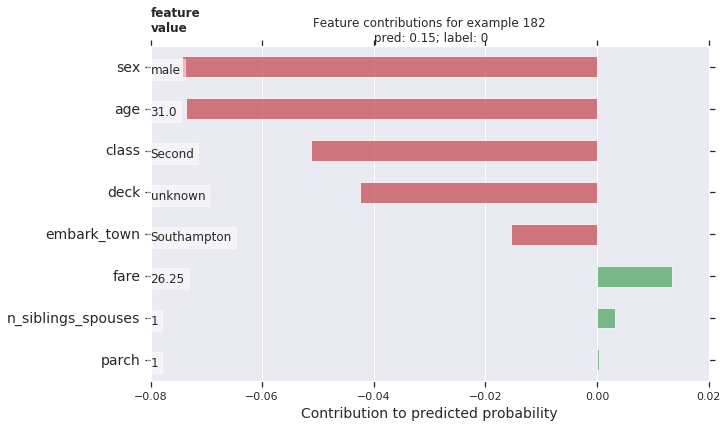
より大きな量の寄与がモデルの予測の上でより大きなインパクトを持ちます。ネガティブな寄与は与えられたサンプルに対する特徴量値がモデルの予測を減少させることを示し、その一方でポジティブな値は予測において増量に寄与します。
バイオリンプロットを使用して全体の分布と比較してサンプルの DFC をプロットすることもできます。
# Boilerplate plotting code.
def dist_violin_plot(df_dfc, ID):
  # Initialize plot.
  fig, ax = plt.subplots(1, 1, figsize=(10, 6))

  # Create example dataframe.
  TOP_N = 8  # View top 8 features.
  example = df_dfc.iloc[ID]
  ix = example.abs().sort_values()[-TOP_N:].index
  example = example[ix]
  example_df = example.to_frame(name='dfc')

  # Add contributions of entire distribution.
  parts=ax.violinplot([df_dfc[w] for w in ix],
                 vert=False,
                 showextrema=False,
                 widths=0.7,
                 positions=np.arange(len(ix)))
  face_color = sns_colors[0]
  alpha = 0.15
  for pc in parts['bodies']:
      pc.set_facecolor(face_color)
      pc.set_alpha(alpha)

  # Add feature values.
  _add_feature_values(dfeval.iloc[ID][sorted_ix], ax)

  # Add local contributions.
  ax.scatter(example,
              np.arange(example.shape[0]),
              color=sns.color_palette()[2],
              s=100,
              marker="s",
              label='contributions for example')

  # Legend
  # Proxy plot, to show violinplot dist on legend.
  ax.plot([0,0], [1,1], label='eval set contributions\ndistributions',
          color=face_color, alpha=alpha, linewidth=10)
  legend = ax.legend(loc='lower right', shadow=True, fontsize='x-large',
                     frameon=True)
  legend.get_frame().set_facecolor('white')

  # Format plot.
  ax.set_yticks(np.arange(example.shape[0]))
  ax.set_yticklabels(example.index)
  ax.grid(False, axis='y')
  ax.set_xlabel('Contribution to predicted probability', size=14)
このサンプルをプロットします。
dist_violin_plot(df_dfc, ID)
plt.title('Feature contributions for example {}\n pred: {:1.2f}; label: {}'.format(ID, probs[ID], labels[ID]))
plt.show()
最後に、LIME と shap のようなサードパーティのツールもまたモデルのための個々の予測を理解する助けになれます。
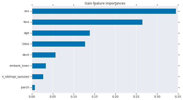
グローバル特徴量重要度
追加として、個々の予測の研究よりもモデルを全体として理解することを望むかもしれません。下で、以下を計算して使用します :
- est.experimental_feature_importances を使用して gain-based 特徴量重要度
- 再配列 (= permutation) 重要度
- est.experimental_predict_with_explanations を使用して総計 DFC
gain-based 特徴量重要度は特定の特徴上で分割するときの損失変化を測定します、一方で再配列重要度は各特徴を一つずつシャッフルしてモデル性能の変化をシャッフルされた特徴に帰することによって評価セット上のモデル性能を評価することにより計算されます。
一般に、再配列特徴量重要度が gain-based 特徴量重要度より好まれます、両者のメソッドは潜在的予測変数が測定のスケールやカテゴリー数が変化する状況で特徴が相関関係があるときには信頼できない可能性はありますが (ソース)。異なる特徴量重要度タイプについての掘り下げた概要と素晴らしい議論については この記事 を調べてください。
1. Gain-based 特徴量重要度
grain-based 特徴量重要度は est.experimental_feature_importances を使用して TensorFlow Boosted Trees estimator に組み込まれます。
importances = est.experimental_feature_importances(normalize=True)
df_imp = pd.Series(importances)

# Visualize importances.
N = 8
ax = (df_imp.iloc[0:N][::-1]
    .plot(kind='barh',
          color=sns_colors[0],
          title='Gain feature importances',
          figsize=(10, 6)))
ax.grid(False, axis='y')
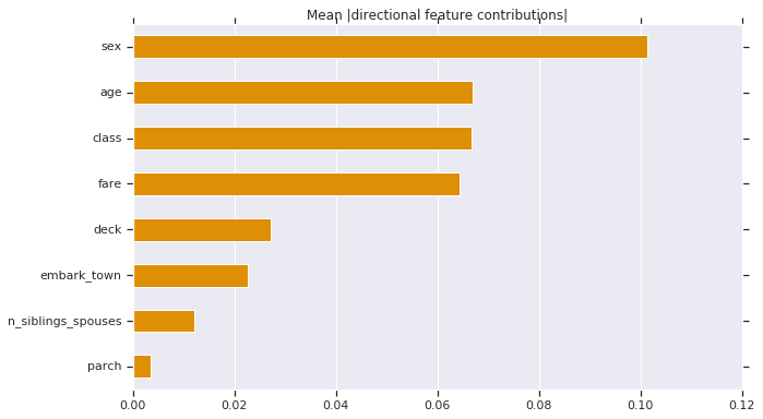
2. DFC の絶対値を平均する
グローバルレベルのインパクトを理解するために DFC の絶対値を平均することもできます。
# Plot.
dfc_mean = df_dfc.abs().mean()
N = 8
sorted_ix = dfc_mean.abs().sort_values()[-N:].index  # Average and sort by absolute.
ax = dfc_mean[sorted_ix].plot(kind='barh',
                       color=sns_colors[1],
                       title='Mean |directional feature contributions|',
                       figsize=(10, 6))
ax.grid(False, axis='y')
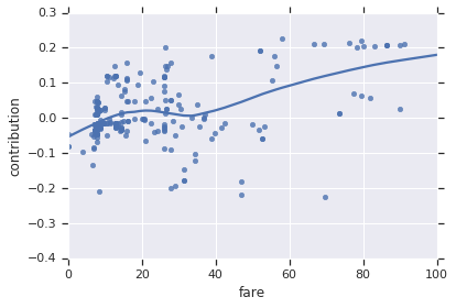
特徴量が変化するとき DFC がどのように変化するかを見ることもできます。
FEATURE = 'fare'
feature = pd.Series(df_dfc[FEATURE].values, index=dfeval[FEATURE].values).sort_index()
ax = sns.regplot(feature.index.values, feature.values, lowess=True)
ax.set_ylabel('contribution')
ax.set_xlabel(FEATURE)
ax.set_xlim(0, 100)
plt.show()
3. 再配列特徴量重要度
def permutation_importances(est, X_eval, y_eval, metric, features):
    """Column by column, shuffle values and observe effect on eval set.

    source: http://explained.ai/rf-importance/index.html
    A similar approach can be done during training. See "Drop-column importance"
    in the above article."""
    baseline = metric(est, X_eval, y_eval)
    imp = []
    for col in features:
        save = X_eval[col].copy()
        X_eval[col] = np.random.permutation(X_eval[col])
        m = metric(est, X_eval, y_eval)
        X_eval[col] = save
        imp.append(baseline - m)
    return np.array(imp)

def accuracy_metric(est, X, y):
    """TensorFlow estimator accuracy."""
    eval_input_fn = make_input_fn(X,
                                  y=y,
                                  shuffle=False,
                                  n_epochs=1)
    return est.evaluate(input_fn=eval_input_fn)['accuracy']
features = CATEGORICAL_COLUMNS + NUMERIC_COLUMNS
importances = permutation_importances(est, dfeval, y_eval, accuracy_metric,
                                      features)
df_imp = pd.Series(importances, index=features)

sorted_ix = df_imp.abs().sort_values().index
ax = df_imp[sorted_ix][-5:].plot(kind='barh', color=sns_colors[2], figsize=(10, 6))
ax.grid(False, axis='y')
ax.set_title('Permutation feature importance')
plt.show()
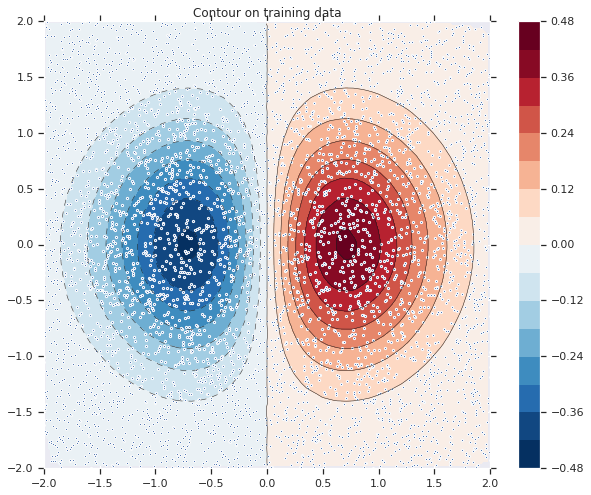
モデル fitting を可視化する
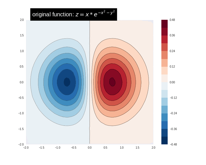
最初に次の式を使用して訓練データをシミュレート/ 作成しましょう :
\[
z=x* e^{-x^2 – y^2}
\]
ここで (z) は貴方が予測しようとする従属変数でそして (x) と (y) は特徴です。
from numpy.random import uniform, seed
from matplotlib.mlab import griddata

# Create fake data
seed(0)
npts = 5000
x = uniform(-2, 2, npts)
y = uniform(-2, 2, npts)
z = x*np.exp(-x**2 - y**2)
# Prep data for training.
df = pd.DataFrame({'x': x, 'y': y, 'z': z})

xi = np.linspace(-2.0, 2.0, 200),
yi = np.linspace(-2.1, 2.1, 210),
xi,yi = np.meshgrid(xi, yi)

df_predict = pd.DataFrame({
    'x' : xi.flatten(),
    'y' : yi.flatten(),
})
predict_shape = xi.shape
def plot_contour(x, y, z, **kwargs):
  # Grid the data.
  plt.figure(figsize=(10, 8))
  # Contour the gridded data, plotting dots at the nonuniform data points.
  CS = plt.contour(x, y, z, 15, linewidths=0.5, colors='k')
  CS = plt.contourf(x, y, z, 15,
                    vmax=abs(zi).max(), vmin=-abs(zi).max(), cmap='RdBu_r')
  plt.colorbar()  # Draw colorbar.
  # Plot data points.
  plt.xlim(-2, 2)
  plt.ylim(-2, 2)
関数をビジュアル化できます。より赤い色がより大きな関数値に対応します。
zi = griddata(x, y, z, xi, yi, interp='linear')
plot_contour(xi, yi, zi)
plt.scatter(df.x, df.y, marker='.')
plt.title('Contour on training data')
plt.show()
fc = [tf.feature_column.numeric_column('x'),
      tf.feature_column.numeric_column('y')]
def predict(est):
  """Predictions from a given estimator."""
  predict_input_fn = lambda: tf.data.Dataset.from_tensors(dict(df_predict))
  preds = np.array([p['predictions'][0] for p in est.predict(predict_input_fn)])
  return preds.reshape(predict_shape)
最初に線形モデルをデータに fit させてみましょう。
train_input_fn = make_input_fn(df, df.z)
est = tf.estimator.LinearRegressor(fc)
est.train(train_input_fn, max_steps=500);
plot_contour(xi, yi, predict(est))

それは非常に良い fit ではありません。次に GBDT モデルをそれに fit させてみましょうそしてモデルがどのように関数に fit するか理解してみましょう。
n_trees = 22 #@param {type: "slider", min: 1, max: 80, step: 1}

est = tf.estimator.BoostedTreesRegressor(fc, n_batches_per_layer=1, n_trees=n_trees)
est.train(train_input_fn, max_steps=500)
clear_output()
plot_contour(xi, yi, predict(est))
plt.text(-1.8, 2.1, '# trees: {}'.format(n_trees), color='w', backgroundcolor='black', size=20)
plt.show()
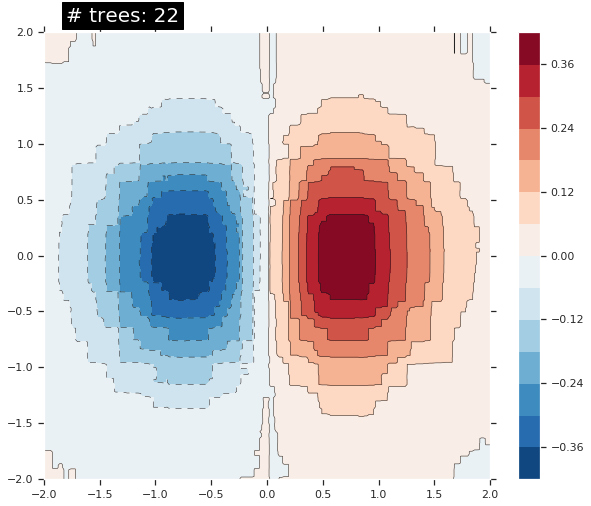
木の数を増やすにつれて、モデルの予測は基礎となる関数をより良く近似します。
最後に
このチュートリアルでは DFC (directional feature contributions) と特徴量重要度テクニックを使用してブースティング木モデルをどのように解釈するかを学習しました。これらのテクニックは特徴量がモデルの予測にどのようにインパクトを与えるかの洞察を提供します。最後に、幾つかのモデルについて決定面を見ることによりブースティング木モデルが複雑な関数にどのように fit するかについての直感もまた得られました。
以上